The most important facts in brief
- Radical change in strategy: Jaguar repositions itself as a purely electric luxury brand with a focus on exclusivity and design.
- Controversial discussions: Critics criticise the loss of traditional British identity, while supporters praise the adaptation to the electrification era.
- High expectations: Market acceptance remains to be seen until actual models are unveiled.
The new Jaguar logo: Design, vision and criticism
Jaguar's rebranding is more than just a new logo or a fresh look. It signals a major change in strategy: the manufacturer wants to move from being a mass-market supplier to a luxury, pure electric brand. This project symbolises the challenges facing many companies, including traditional car manufacturers, in the age of electrification.
The new logo is minimalist, modern and breaks with the previous design, which was characterised by dynamism and tradition. But it is precisely this simplicity that polarises opinion: While some see it as contemporary and elegant, others criticise the lack of recognisability and the loss of British design characteristics.
Jaguar rebranding: Why the reorientation was necessary
The automotive industry is changing. Electrification is levelling out differentiating features such as engine performance or reliability, which means that other aspects such as design and brand essence are coming to the fore. Jaguar has recognised that a repositioning is necessary in order to survive in an increasingly competitive market. The brand is therefore focussing on the following core strategies:
- Exclusivity: With prices that come close to Bentley and Aston Martin, Jaguar is deliberately aimed at an affluent, globally orientated target group.
- Electrification: The focus on sustainability and zero-emission vehicles reflects the spirit of the times and emphasises Jaguar's claim to innovation.
- Design: With its simple logo and clean lines, Jaguar uses a visual language that conveys modernity, elegance and change.
The controversy: Loss of identity or courageous reorientation?
Jaguar's new logo and strategic direction have met with mixed reactions. Critics accuse the brand of abandoning its British identity and losing its emotional connection with long-standing customers. In particular, the simple logo is seen as a break with the brand's traditional past.
A viral TikTok video by a designer who wanted to 'improve' the logo attracted additional attention. The humorous but creative discussion reflects the divided public opinion: Click here to see the TikTok video.
The challenge of defining the target group
While there is a lot of discussion about the design in terms of aesthetics, the new design expresses one thing above all else: A bold evolution of a new target group. Modern, open-minded and open-hearted, with an appetite for a futuristic and electric future and a willingness to pay for it. This is how Jaguar presents itself to the customer of the future.
But while Jaguar is clearly targeting an affluent, global audience, it remains unclear whether they will buy into the new concept. The lack of concrete product presentations makes it difficult to establish a connection with the new brand identity. A particular criticism is that the change has been bold, but perhaps too abrupt.
Rebranding in the automotive industry: An opportunity for innovation
Jaguar's case is an example of the challenges facing brands in disruptive times. Like Volkswagen with its ID series or BMW with its i models, Jaguar is looking for its place in the age of electric mobility. Whether the brand succeeds in setting new standards depends on the acceptance of both the design and the future models.
As part of its strategic repositioning, Jaguar unveiled the "Type 00" concept car at Miami Art Week on 2 December. This all-electric model is a striking expression of the brand's new design philosophy, dubbed "Exuberant Modernism". Distinctive features such as butterfly doors, a panoramic roof and a minimalist interior design with floating dashboards are a clear indication of Jaguar's vision for the future. The colour scheme of "Miami Pink" and "London Blue" bridges the gap between modern style and the brand's British roots. With "Type 00", Jaguar offers a promising preview of the new production models that will be launched from 2025.
How the Jaguar rebranding polarises online
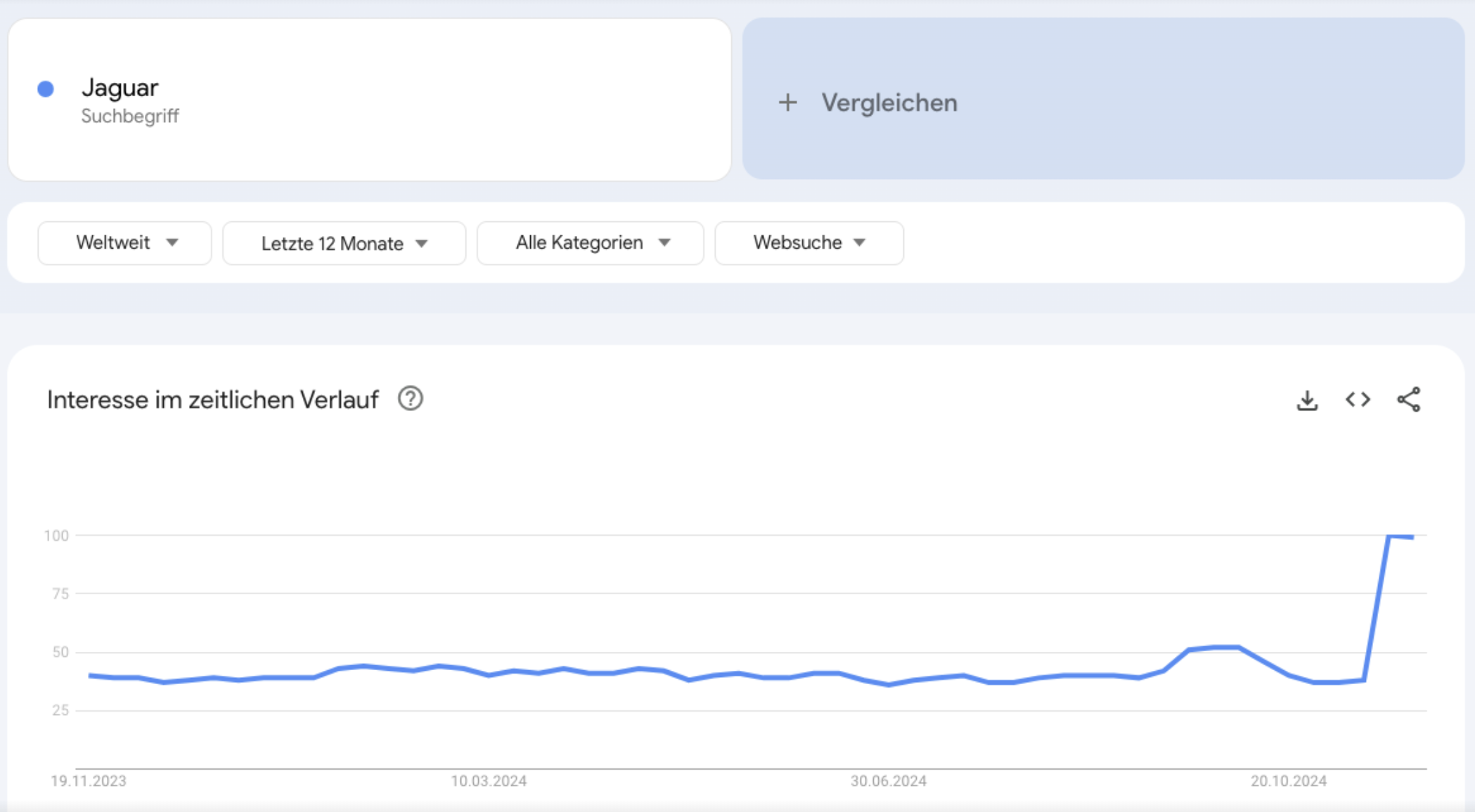
Interest in Jaguar rebranding and the new Jaguar logo soared following the launch of the new design. Looking at search interest via Google Trends, it is clear that the discussion around Jaguar's strategic repositioning is resonating with a wide audience.

If it all turns out to be nothing more than a cleverly orchestrated marketing stunt, it has already had an impact and successfully focused the public's attention on Jaguar.
Bold rebranding with an uncertain future
The controversy is a reminder of the challenge facing brands that want to be globally relevant without losing their cultural roots. Ultimately, the success of this reorientation will only become clear when the new models are launched and the market accepts them. Until then, it remains to be seen whether Jaguar's bold strategy can truly set new standards.


